5 Tips to Improve Your Frontend Developer Portfolio Design
After months of learning web development, mastering HTML, CSS, and JavaScript, you feel it's time to showcase who you are and why you're awesome. You decide to take the first step towards that goal: creating your web portfolio.
You check out other students' portfolios, look for ideas online, and even consult ChatGPT. After all the research, you start coding it. However, you realize you didn't choose a color palette beforehand. You didn't think about whether the design is visually pleasing and accessible. You decide to ignore it and spend an entire night moving boxes and writing getElementById's until you finally finish. But...
 The result wasn't as aesthetically pleasing as you expected.
What Went Wrong?
The interface might not meet basic expectations due to the absence of fundamental principles that every interface should follow. At Platzi, we have a course dedicated to this, the User Interface Design Fundamentals Course. I also believe that everyone should take the Introduction to Design Course, which is universally useful for our daily lives and our aesthetic eye as Frontend Developers.
If this issue has happened or is happening to you, believe me, it's normal. Frankly, my first portfolio was terrible! I knew nothing about design, not even small tips or fundamentals. I used too many contrasting colors, a font that didn't stand out, and the whole site was centered text with at most three images. In fact, I'll show you:
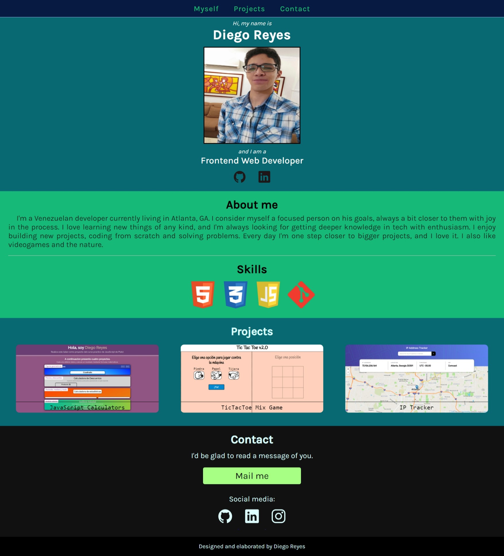
It was awful.
I've encountered other programmers who have faced similar problems. And that's okay! Our job isn't to design. But, it's true that if we want to have a wonderful personal page, it will represent us on the internet. Given that, it's recommended that it be aesthetically pleasing and comfortable for viewers. If this is a challenge for you, don't worry. You can learn anything you set your mind to, even about design.
I'll share 5 fundamental tips to improve your portfolio design. These are just a starting point, as they cover the most common mistakes I've seen.
1. Choose a Strict and Efficient Color Palette
There are many websites and apps where you can find beautiful and eye-friendly color palettes. You just need to choose one and apply it effectively.
Some of these sites are:
- Coolors - The super fast color palettes generator!
- Color Palettes for Designers and Artists - Color Hunt
There are many ways to apply a color palette to your site. My favorite is the 60 — 30 — 10 rule. This rule involves choosing three colors for your palette, and each serves a distinct purpose:
- 60% Color ⇒ Your dominant color. Used for general contexts like backgrounds. The most visible color.
- 30% Color ⇒ Your secondary color. Used to complement the dominant color. Its usage generates visual interest, grabbing the user's attention.
- 10% Color ⇒ Your functional color. This is your strongest, most contrasting color in the palette. It's impossible for the user not to notice it.
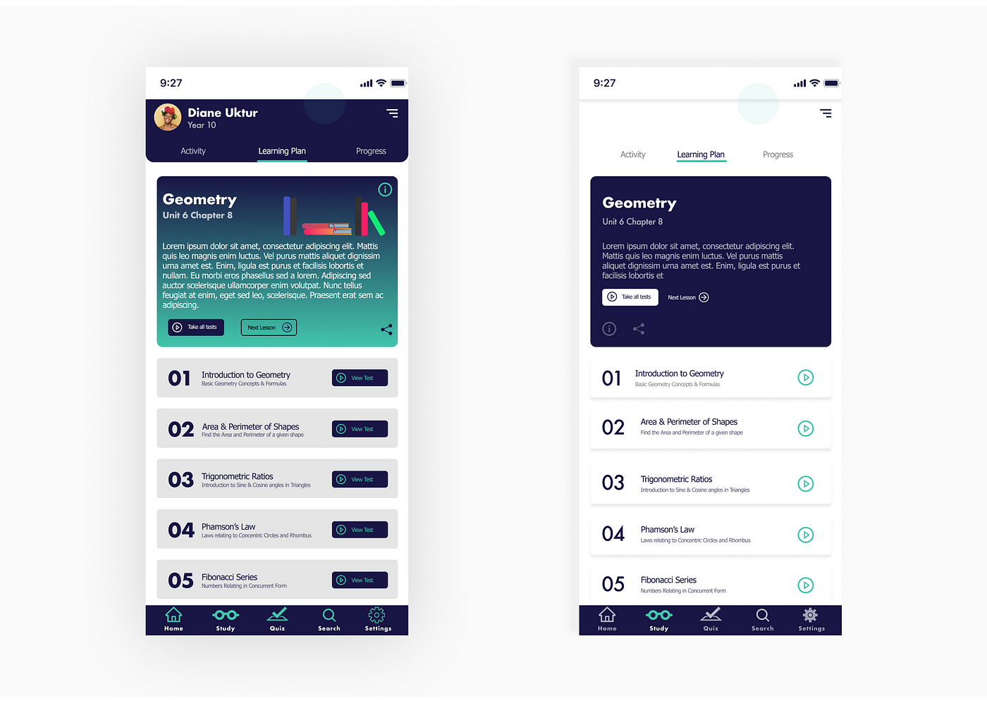
You can take the above example. Both interfaces use the same color palette. However, in the left interface, you can't tell the meaning of each color; it's just a colorful mess, causing the user to be unsure where to interact. In the example on the right, colors are used wisely and are neutralized, following the 60 — 30 — 10 rule.
- The dominant color (white) occupies the most space, making it less attention-grabbing.
- The secondary color (navy blue) is used in elements you want to highlight, drawing the user's attention.
- The functional color (green) is used sparingly, but where it is, it definitely captures the user's attention and communicates that this element is of maximum importance. It's used in the Play button and the current section highlight at the bottom bar.
2. Maintain Symmetrical Spacing Between Elements
Nature is symmetrical. Biologically, our left side of the body is identical to the right side. We are accustomed to symmetry, and it's visually pleasing. Thus, make sure your elements are symmetrical too, specifically in terms of spacing. Some of the symmetrical spacings that are important to consider are:
- Left Margin ↔ Right Margin.
- Top Margin ↔ Bottom Margin.
- Left Padding ↔ Right Padding.
- Top Padding ↔ Bottom Padding.
Let's look at some examples:
Example 1
In this layout, the "Skills" title lacks symmetry between its top and bottom margin. It's visually uncomfortable.
By tweaking the DOM, I increased the font size slightly and balanced the top and bottom margin of the title. Notice the difference below?
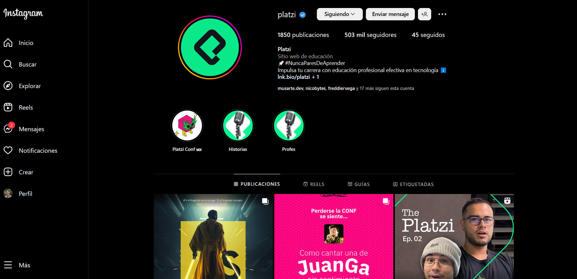
You can see how Instagram maintains symmetrical spacing between all its elements. If an element has a 20px top margin, it should also have a 20px bottom margin.
Example 2
In this layout, there isn't vertical alignment between the "Skills," "Contact," and "Footer" sections. It's ideal to have symmetric alignment and spacing between these sections, as argued by UX Engineer.
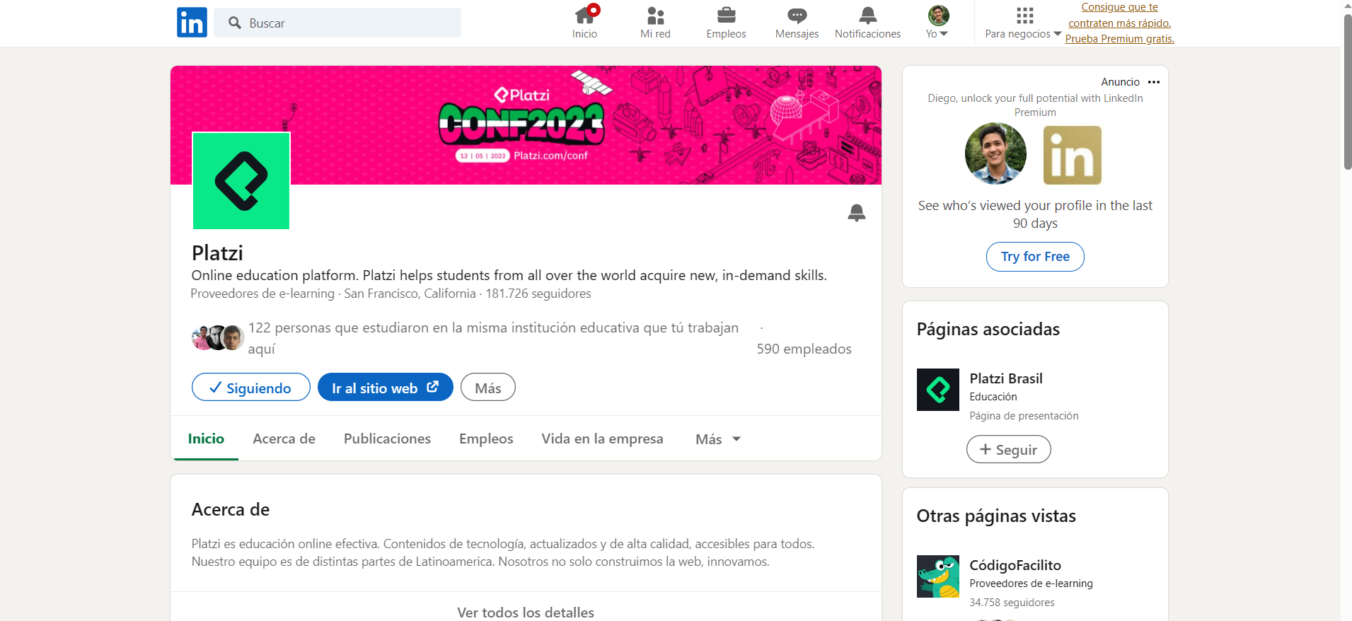
You can see how LinkedIn manages to maintain comfortable alignment and spacing.
3. Prioritize Consistent Look and Feel
The term look and feel refers to the experience and emotions users get from using an interface. A solid look and feel will make users think, "Hmm, I'm not sure why, but I like this." It's often described as the "personality" of the interface.
Users might feel pleasure because they see minimalism, formality, a 90s style, among other styles. Conversely, they might feel discomfort because they see a childish or overloaded interface, among other reasons.
You might not get a good "feel" from this interface.
We unconsciously associate feelings at first glance, and in the case of an interface, we expect the rest of it to evoke the same feelings consistently.
If your site is friendly and formal at the start, then becomes informal and humorous as the user scrolls, they'll naturally think, "What on earth is this?" Another example is applying a hover effect to an element that isn't interactive; it will confuse users.
Before applying a hover effect, consider whether it's necessary for your interface. Remember: if everything is important, nothing is.
4. Avoid Unnecessary Hover Effects and Prioritize Useful Ones
An interactive effect on a non-interactive element isn't coherent, right?
Hover effects steal the user's attention, so it's best to use them only on elements that are highly important and interactive, like a link or a button.
These effects easily indicate that an element will do something when pressed. Conversely, if you apply a hover effect to an element that can't be pressed, it will confuse users.
Before applying a hover effect, consider if it's truly necessary for your interface. Remember: if everything is important, nothing is.
5. Apply Visual Weight Appropriately
Referring back to the previous point, not all information carries the same level of importance for the user.
If you already know which element is most important within a group of elements, then give it the red carpet and studio lights it deserves! You can achieve this by understanding the concepts of visual weight and hierarchy.
Visual weight and hierarchy deserve two full classes. You can actually find them in the Introduction to Design Course, and I recommend checking them out to apply to your portfolio.
For now, here are some quick tips.
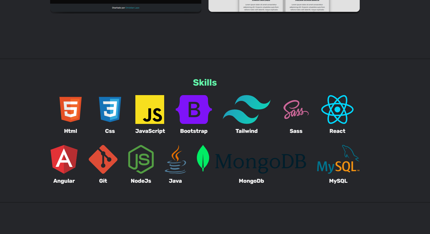
You have various ways to make certain elements stand out from others. You can use these tools in an element:
- Size
- White space
- Color
- Shape
An element that differs in some of these styles from another element can increase or decrease its visual weight. In other words, you can control what the user sees.
Optimize your styles to highlight specific information as needed. You can see the example below to observe the before and after of applying visual weight effectively:
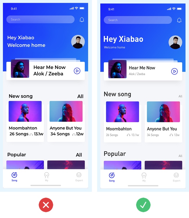
The major comparisons are:
- Welcome Message Directly greeting the user creates a stronger human-machine connection, so it has a larger size for more prominence. The message "Welcome home" is more generic, so its size is reduced.
- Song Cards The song name is the most important information and is displayed in a larger, bolder font. The other details are secondary, so they're smaller and have less contrasting color (gray).
- Section Headers The "New Song" and "Popular" titles provide important information for identifying the content type. The word "All," placed to the right, only refers to a filter. This is less important, so its size is reduced, and its color contrast is muted (gray).
What's Next?
By applying these fundamental tips, you can make a distinctive change in your portfolio without needing to be a designer. You can learn more about the topic by reading these other articles from the community:
- Why You Need a Professional Portfolio as a Web Developer - Platzi
- 15 Impressive Web Dev Portfolios for Inspiration - Platzi
Remember: Design, like programming, is a creative process. Take a moment to imagine how your portfolio's design could apply these tips, much like solving a programming challenge.
Made with 💙 by Diego Reyes